Hello friends, you will learn how to create image slider HTML with CSS and JavaScript. This is a very common and important feature of any kind of website because it makes the website’s home page attractive. In order to do so, you must have some basic knowledge of HTML, CSS, and JavaScript.
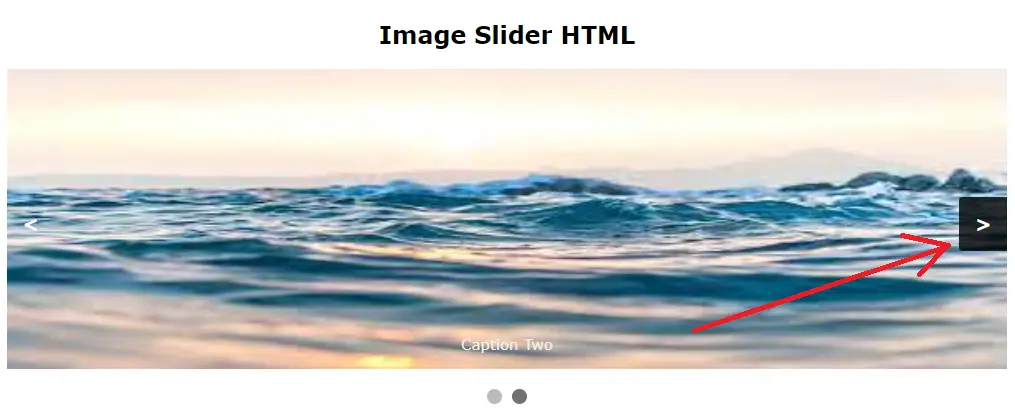
A slider is used to move or rotate the images one by one by clicking the arrow or dots given in below the image on both sides. You can use this slider for multiple images. Let us take an example as shown below.
Also read, How to add a google map to website with marker with Example
Required steps to create image slider HTML with CSS and JavaScript
Step 1:- Create a folder in the root directory of your local server and paste two or three images inside that folder.
Step 2:- Create an HTML file inside that folder as shown below
image_slider.html
<!DOCTYPE html>
<html>
<head>
<meta name="viewport" content="width=device-width, initial-scale=1">
</head>
<body>
<br><br>
<h2 style="text-align:center;">Image Slider HTML</h2>
<div class="slideshow-container">
<div class="mySlides fade">
<div class="numbertext">1 / 2</div>
<img src="nature1.jpg" style="width:100%" height="300">
<div class="text">Caption Text</div>
</div>
<div class="mySlides fade">
<div class="numbertext">2 / 2</div>
<img src="nature2.jpg" style="width:100%" height="300">
<div class="text">Caption Two</div>
</div>
<a class="prev" onclick="plusSlides(-1)">&lt;</a>
<a class="next" onclick="plusSlides(1)">&gt;</a>
</div>
<br>
<div style="text-align:center">
<span class="dot" onclick="currentSlide(1)"></span>
<span class="dot" onclick="currentSlide(2)"></span>
</div>
</body>
</html>
Step 3:- Add the CSS property to the above HTML file inside the head tag as shown below
<style>
* {box-sizing: border-box}
body {font-family: Verdana, sans-serif; margin:0}
.mySlides {display: none}
img {vertical-align: middle;}

/* Slideshow container */
.slideshow-container {
  max-width: 1000px;
  position: relative;
  margin: auto;
}

/* Next & previous buttons */
.prev, .next {
  cursor: pointer;
  position: absolute;
  top: 50%;
  width: auto;
  padding: 16px;
  margin-top: -22px;
  color: white;
  font-weight: bold;
  font-size: 18px;
  transition: 0.6s ease;
  border-radius: 0 3px 3px 0;
  user-select: none;
}

/* Position the "next button" to the right */
.next {
  right: 0;
  border-radius: 3px 0 0 3px;
}

/* On hover, add a black background color with a little bit see-through */
.prev:hover, .next:hover {
  background-color: rgba(0,0,0,0.8);
}

/* Caption text */
.text {
  color: #f2f2f2;
  font-size: 15px;
  padding: 8px 12px;
  position: absolute;
  bottom: 8px;
  width: 100%;
  text-align: center;
}

/* Number text (1/3 etc) */
.numbertext {
  color: #f2f2f2;
  font-size: 12px;
  padding: 8px 12px;
  position: absolute;
  top: 0;
}

/* The dots/bullets/indicators */
.dot {
  cursor: pointer;
  height: 15px;
  width: 15px;
  margin: 0 2px;
  background-color: #bbb;
  border-radius: 50%;
  display: inline-block;
  transition: background-color 0.6s ease;
}

.active, .dot:hover {
  background-color: #717171;
}

/* Fading animation */
.fade {
  animation-name: fade;
  animation-duration: 1.5s;
}

@keyframes fade {
  from {opacity: .4}
  to {opacity: 1}
}

/* On smaller screens, decrease text size */
@media only screen and (max-width: 300px) {
  .prev, .next,.text {font-size: 11px}
}
</style>
The above CSS property is used to decorate the arrow button placed on both sides of the image and the dots placed below the image.
Step 4:- Add the javascript code before the body tag of the HTML file as shown below
<script>
let slideIndex = 1;
showSlides(slideIndex);

function plusSlides(n) {
  showSlides(slideIndex += n);
}

function currentSlide(n) {
  showSlides(slideIndex = n);
}

function showSlides(n) {
  let i;
  let slides = document.getElementsByClassName("mySlides");
  let dots = document.getElementsByClassName("dot");
  if (n > slides.length) {slideIndex = 1}
  if (n < 1) {slideIndex = slides.length}
  for (i = 0; i < slides.length; i++) {
    slides[i].style.display = "none";
  }
  for (i = 0; i < dots.length; i++) {
    dots[i].className = dots[i].className.replace(" active", "");
  }
  slides[slideIndex-1].style.display = "block";
  dots[slideIndex-1].className += " active";
}
</script>
Complete Code:-
<!DOCTYPE html>
<html>
<head>
<meta name="viewport" content="width=device-width, initial-scale=1">
<style>
* {box-sizing: border-box}
body {font-family: Verdana, sans-serif; margin:0}
.mySlides {display: none}
img {vertical-align: middle;}
/* Slideshow container */
.slideshow-container {
max-width: 1000px;
position: relative;
margin: auto;
}
/* Next & previous buttons */
.prev, .next {
cursor: pointer;
position: absolute;
top: 50%;
width: auto;
padding: 16px;
margin-top: -22px;
color: white;
font-weight: bold;
font-size: 18px;
transition: 0.6s ease;
border-radius: 0 3px 3px 0;
user-select: none;
}
/* Position the "next button" to the right */
.next {
right: 0;
border-radius: 3px 0 0 3px;
}
/* On hover, add a black background color with a little bit see-through */
.prev:hover, .next:hover {
background-color: rgba(0,0,0,0.8);
}
/* Caption text */
.text {
color: #f2f2f2;
font-size: 15px;
padding: 8px 12px;
position: absolute;
bottom: 8px;
width: 100%;
text-align: center;
}
/* Number text (1/3 etc) */
.numbertext {
color: #f2f2f2;
font-size: 12px;
padding: 8px 12px;
position: absolute;
top: 0;
}
/* The dots/bullets/indicators */
.dot {
cursor: pointer;
height: 15px;
width: 15px;
margin: 0 2px;
background-color: #bbb;
border-radius: 50%;
display: inline-block;
transition: background-color 0.6s ease;
}
.active, .dot:hover {
background-color: #717171;
}
/* Fading animation */
.fade {
animation-name: fade;
animation-duration: 1.5s;
}
@keyframes fade {
from {opacity: .4}
to {opacity: 1}
}
/* On smaller screens, decrease text size */
@media only screen and (max-width: 300px) {
.prev, .next,.text {font-size: 11px}
}
</style>
</head>
<body>
<br><br>
<h2 style="text-align:center;">Image Slider HTML</h2>
<div class="slideshow-container">
<div class="mySlides fade">
<div class="numbertext">1 / 2</div>
<img src="nature1.jpg" style="width:100%" height="300">
<div class="text">Caption Text</div>
</div>
<div class="mySlides fade">
<div class="numbertext">2 / 2</div>
<img src="nature2.jpg" style="width:100%" height="300">
<div class="text">Caption Two</div>
</div>
<a class="prev" onclick="plusSlides(-1)">&lt;</a>
<a class="next" onclick="plusSlides(1)">&gt;</a>
</div>
<br>
<div style="text-align:center">
<span class="dot" onclick="currentSlide(1)"></span>
<span class="dot" onclick="currentSlide(2)"></span>
</div>
<script>
let slideIndex = 1;
showSlides(slideIndex);
function plusSlides(n) {
showSlides(slideIndex += n);
}
function currentSlide(n) {
showSlides(slideIndex = n);
}
function showSlides(n) {
let i;
let slides = document.getElementsByClassName("mySlides");
let dots = document.getElementsByClassName("dot");
if (n > slides.length) {slideIndex = 1}
if (n < 1) {slideIndex = slides.length}
for (i = 0; i < slides.length; i++) {
slides[i].style.display = "none";
}
for (i = 0; i < dots.length; i++) {
dots[i].className = dots[i].className.replace(" active", "");
}
slides[slideIndex-1].style.display = "block";
dots[slideIndex-1].className += " active";
}
</script>
</body>
</html>
Step 5:- Run the HTML file in your browser as shown below
https://localhost/projectfolder/image_slider.html
Conclusion:- I hope this tutorial will help you to understand the overview of the image slider. IF there is any doubt then please leave a comment below.