In this tutorial, I will discuss the media query CSS for all devices. Actually, media query CSS or CSS3 comes from CSS2. In CSS2 the @media rule, all the styles were based on different types of devices like computer screens, printers and television, and so on.
On the other hand, media queries css3 inherits the rules of CSS2 media types and checks for the capability of the device instead of the type of device.
We can obtain the below features using a media query.
- width and height of the viewport
- width and height of the device
- orientation of the device whether the device is in landscape mode or portrait mode.
- resolution of the device
Media queries are used to deliver predefined stylesheets according to the device such as desktops, laptops, tablets, and mobile phones automatically.
Also read, Overflow in CSS with Example
Supported browsers of media queries are as follows
- Google Chrome
- Microsoft Edge
- Mozilla
- Safari
- Opera
Number of media types:-
- all:- Used for all devices
- print:- Used for printers
- screen:- Used for computer screens, laptops, smartphones, etc.
- speech:- Used for screenreaders that “read” the page out loud
Syntex of media query:-
@media not|only mediatype and (expressions) {
  CSS-Code;
}
A media query contains media type and one or more expressions that result in true or false.
The result of the query is true if the media type matches the type of the device where the document is displayed and all expressions in the media query are true. When the media query is true, the related style sheets are applied following the normal CSS properties.
Can I use a media query inside the style tag of the head section? YES
Let us take an example to see how media query works
HTML File:- (mediaquery.html)
<!DOCTYPE html>
<html>
<head>
<meta name="viewport" content="width=device-width, initial-scale=1.0">
<style>
body {
  background-color: lightgreen;
}
@media screen and (min-width: 480px) {
  body {
    background-color: blue;
  }
}
</style>
</head>
<body>

<h1 style="color: white;">Resize the browser window to see how the color changes!</h1>
<p style="color: white;">The background color will change according to the mediatype .i.e. screen and the viewport is more than 480px .</p>

</body>
</html>
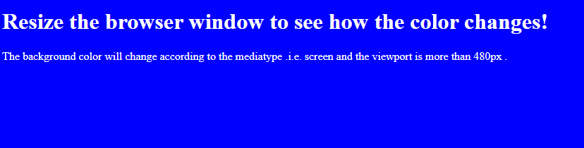
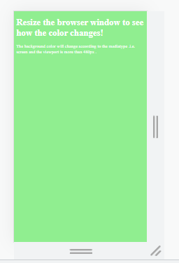
In this example, you will see that the background color of the HTML web page will change according to the size of the device. If the device size is more than 480px then the background will be blue color and if the device size is less than 480px then the background will be green.
Output for device size greater than 480px
Output for device size less than 480px
Conclusion:- I hope this tutorial will help you to understand the overview of media query CSS for all devices. If there is any doubt then please leave a comment below